Case Study ~ UI/UX Design
UI Visual Design, web application design, UX writing
Playbook Education
Creating a tool that targets the needs of design classrooms.
Team
Dixie Waigel
Jihyun Kim
Andrea Juwono
Annie Pan (project mentor)
Role
Design Consultant
User Research Lead
End Product Designer (solo)
Timeline
August 2021 - December 2021
Solo: August 2024 - Oct 2024
Tools
Figma
There are currently many resources to help students learn in a standard classroom setting. Yet, the design classroom and its unique needs are ignored.
Playbook challenged our team to discover how to incorporate their creative cloud storage program into the classroom.
Project overviewHow might we best introduce a new cloud storage tool, Playbook, to design students and professors as a valuable educational resource?
Thus... we asked:sneak peak! Solution PreviewPlaybook Education is a cloud storage for design classrooms that features an expressive and streamlined commenting/feedback system
Variety of methods to give feedback
Integrate Playbook boards in feedbacks
More transparency and control over shared files
How did we get there? Here’s the process…
Click to navigate to each section01
(Research)02
(Synthesis)03
(Ideation)04
(Design Solution)My Role:
As a UI/UX Design Consultant, I worked closely with my team members and the executives of Playbook to gain user insights throughout the project.
Due to the research-heavy aspect of the project, I ideated and created the final designs as a solo project.
As a User Research Lead, I organized project timelines, led team and client meetings, organized a Playbook workshop to gain user insights, and designed marketing assets to promote the workshop.
ResearchDiscovering how design students and instructors use cloud storage.
Overarching Question
What are some things a design classroom needs that are not provided by other classroom tools? What are some ways that design students and instructors interact with cloud storage that are not supported by other cloud storage tools? In order to design the most optimal solution to these problems, I focused on observing how students and instructors use cloud storage within a design classroom context.
-
Understand what other tools (cloud storage or non-cloud storage) design students and instructors are currently using, and what is something that they do well and lack.
-
I conducted interviews to better understand the context of diary study participants. For instance, I learned what file-sharing tools have been important for education, and what other educational tools for cloud storage should be implemented.
-
Through the diary studies, I identified the main pain points of using cloud storage, determined how cloud storage is used in an academic setting, and discovered different cloud storage use cases for students and instructors.
-
I organized a workshop for Playbook as a way to introduce the tool as it is to design students and instructors, and received insights on how students see themselves using Playbook in the future.
An overview of my affinity map of user research findings
SynthesisIdentifying what design classrooms need the most
Both design students and instructors value being able to provide and receive comprehensive feedback.
Our primary personas include design students and instructors. We identified the goals, feedback methodology, motivation, and pain points of both types of personas using data from our diary studies and surveys.
Click on each profile to explore their personas in detail:>> Both Jessica and James have needs for a way to give and receive detailed and actionable feedbacks regarding their design projects.
Design classrooms use Canvas and Google Drive to store project assets and submit work. However, commenting and communication features are often limiting and do not allow a streamlined way of giving detailed and actionable feedback.
One of the most important ways to learn design is through feedback and critique. Students and instructors lamented that commenting features on the most popular cloud storage platforms are too limited. Students and instructors seek ways to communicate on shared files through images, long comments, and reactions (i.e. preference for sharing files on Slack to receive reactions).
Other valuable factors: Efficiency and security.
Having only a new tool for providing feedback that is not provided by other platforms is not enough. Students and instructors value the following for any tool that they use in a classroom setting:
This all boils down to the following design goals:
Efficiency in work-flow for both students and instructors
Eliminate the problem of having to access multiple different platforms for feedbacks. Allow commenting and previewing for all design files without having to download, including but are not limited to .psd and .ai files.
Ability to provide and receive in-depth feedback
Allow mark-ups and comments on specific part of image creations. Create a way to give and receive in-depth feedback without creation of a separate document. Allow image-based or handwritten feedback.
Expressive way to give and receive feedback
Allow a more fun and creative way to give feedbacks. Build support among peers and make engaging with peers’ work more interesting.
Transparency and control over sharing and commenting settings
Allow users to know who is able to view, edit, or comment on a file. Give control over whether comments are anonymous.
IdeationProposed features and user flow
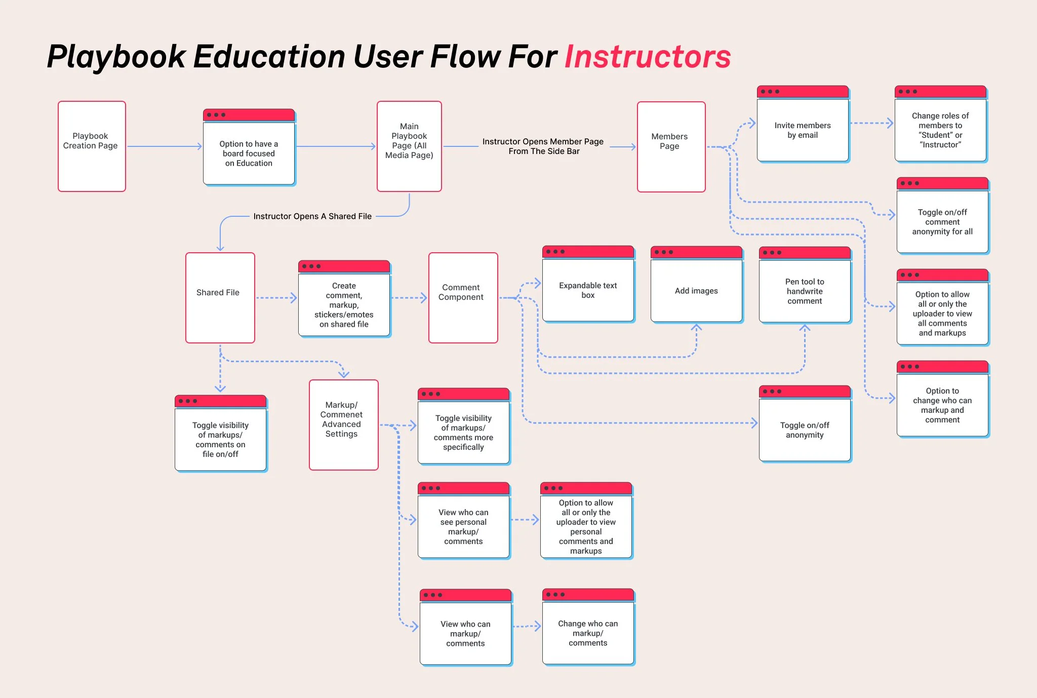
User flows for students and instructors
Following the outlined design goals, I brainstormed some features that would best improve user experience according to user needs. This includes additional settings for instructors and students to have more control over their privacy and tools that allow commenting that is useful in a design setting.
Below shows the flow of how students and instructors would navigate through these new features.
Wireframes - where do new features fit into existing systems?
Playbook creation page
Allows users to access new features, which are most viable in a classroom setting, in its own bracket.
This is also consistent with Playbook’s current user experience model, where the most relevant features are highlighted for the context of the playbook, dictated by users’ selection during creation.
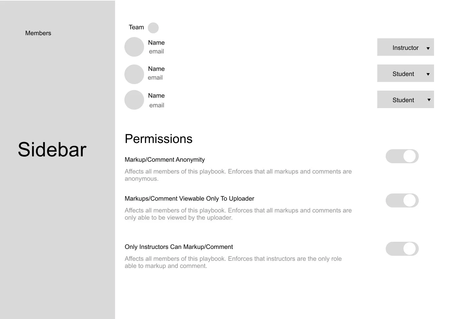
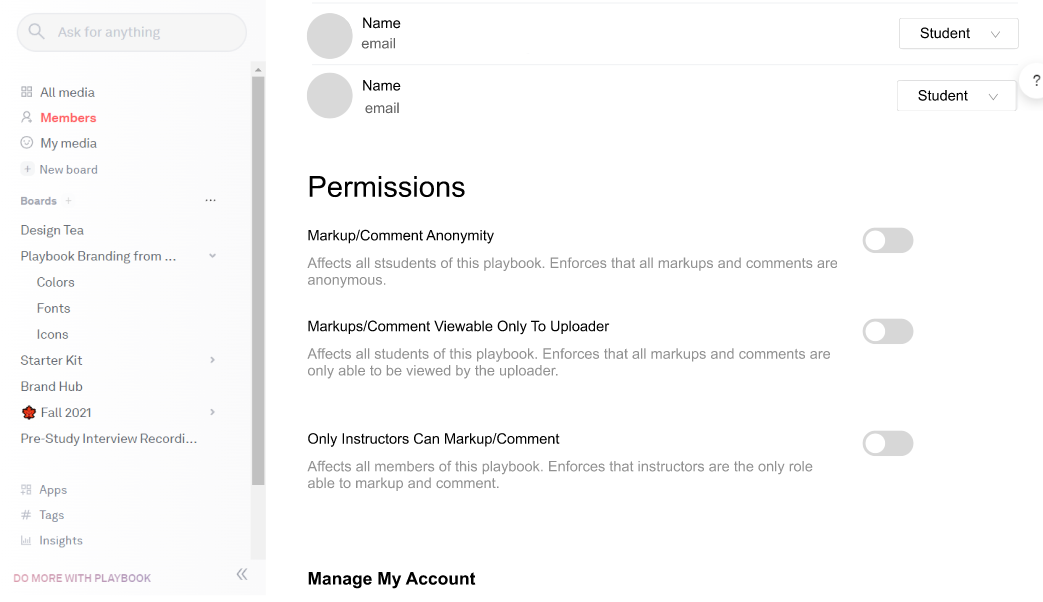
Playbook general settings
Different roles will have different access to permissions. Students and instructors will have different levels of access to file settings.
Permissions shown here are exclusive to instructors.
This allows more control over file and comment privacy.
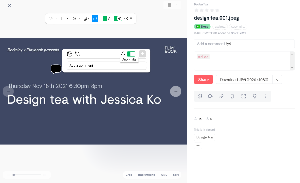
Expressive commenting in specific files
To allow expressive commenting, I incorporated features that most designers are familiar with: tool bars similar to that of Figjam and Mural.
Here, it shows how feedback can be provided with stickers, the pen tool, and comments. The visibility of these expressive commenting features can also be adjusted (see below for advanced setting)
In-depth comment/feedback can be made with hand-written notes, image attachments, and expandable text-boxes.
File-specific markup settings
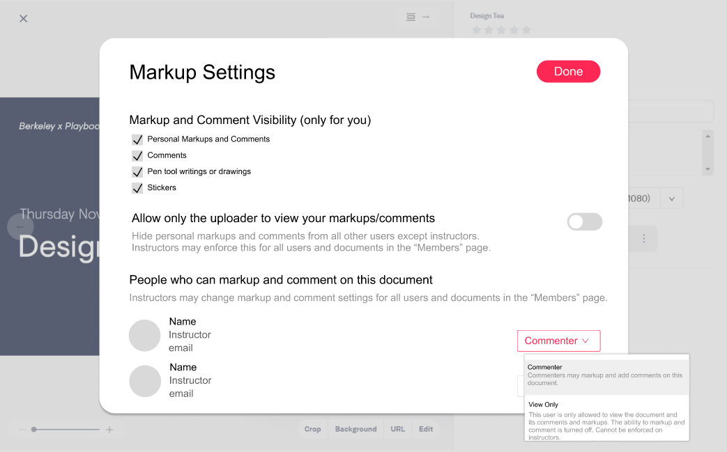
More file-specific settings are needed to adjust the visibility of markups and comments. Too many markups and comments would reduce the visibility of the file and become overwhelming. Users may hide all markups on the tool bar, but they can adjust for specific ones in the more advanced setting.
File-specific settings also include the viewability of user’s personal markups/comments. Users may choose to make their markups/comments only viewable to the file owner and instructors for more control over their privacy. This also encourages more open and honest feedback.
Mid-fidelity Designs and User Testing
In this iteration, I focused on making sure all the copies are clear and created iconographies to prepare for user testing.
Usability Testing
Objective: Understanding the intuitiveness of initial prototypes and incorporating feedback
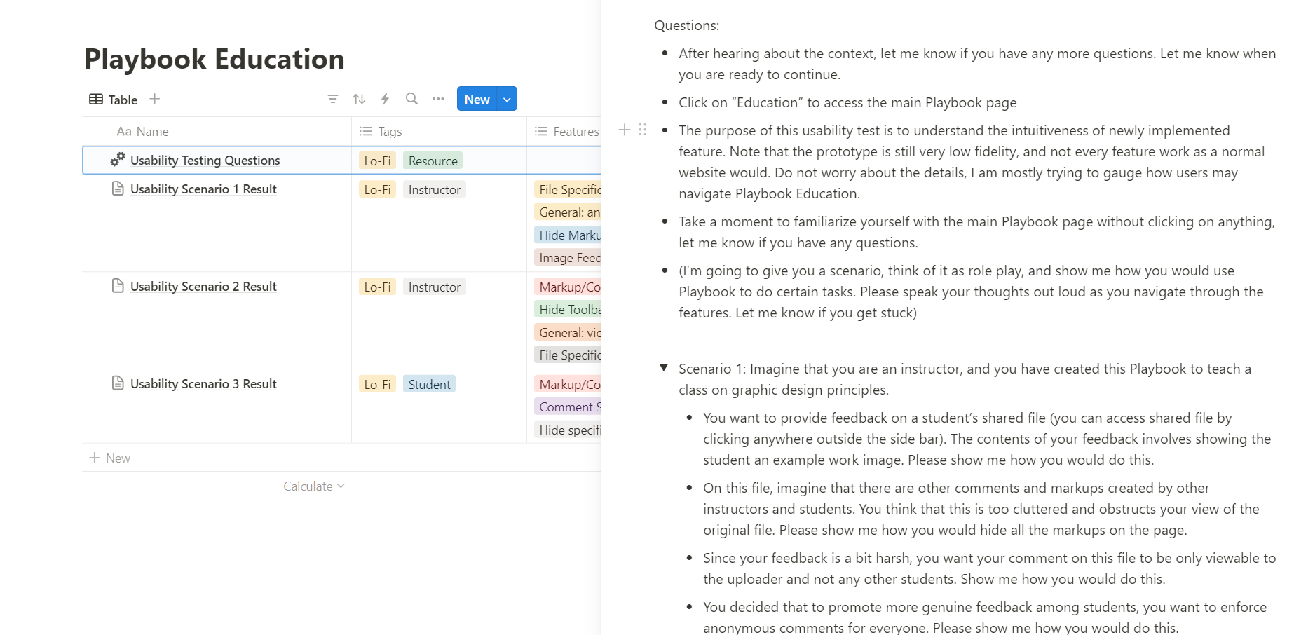
Methodology: I asked participants to follow a scenario and walk me through how they might accomplish certain tasks. Throughout the usability test, I asked them to speak their thoughts out loud
Recruitment: 3 participants, one student and two instructors
Results / Notes
Users wish to see who is currently viewing the file
There are instructor needs for additional setting specific to file to make all comments anonymous
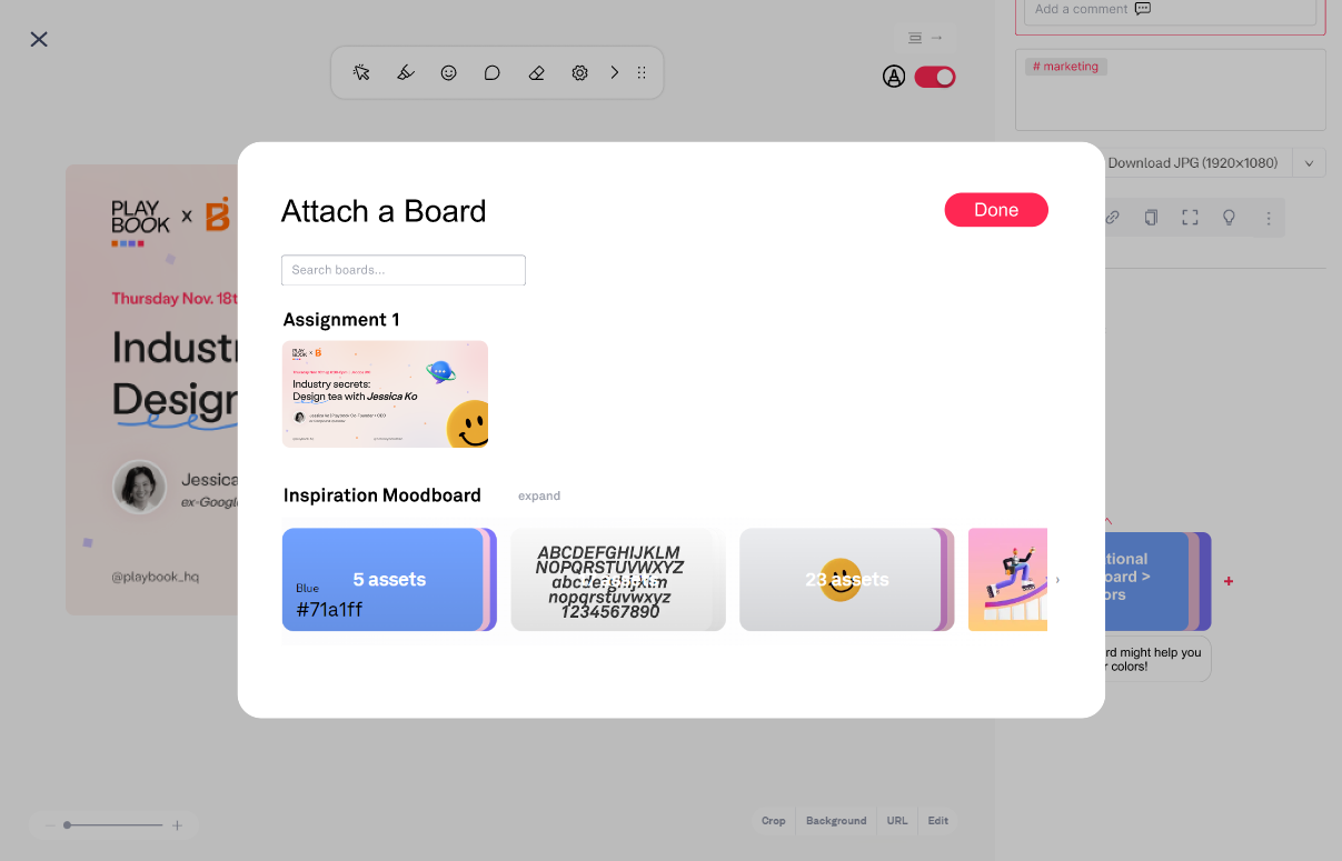
Instructors wish for the ability to attach another Playbook board to the shared file to share moodboards
Students and instructors said they would use highlighters more than the pen tool
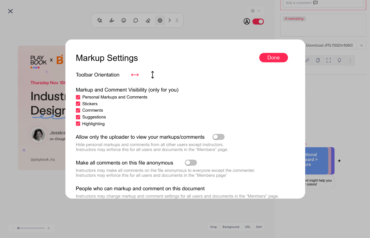
Students and instructors wish that the tool bar can be adjusted to be vertical to better see certain parts of the file
Resulting Change
Tool bar modified to replace pen tool with highlighter
New component for seeing who is currently viewing the file
Boards from the playbook can now be attached to the file to allow more in-depth feedback. Access points to attaching a board include adding a board directly from the file sidebar or as a comment.
Settings were added to change the orientation of the toolbar. Instructors may also make all comments on this file anonymous, without changing this setting for other files in the playbook.
SolutionPlaybook Education
for a more in-depth view of all design work:Variety of methods to give feedback
Integrate Playbook boards in feedbacks
More transparency and control over shared files
ReflectionPossible Future Improvements
More user testing could be done to see if the copies for the settings are easily understandable, not too wordy, and effective.
01
More investigation and design iterations should be conducted to understand what other privacy setting needs are looked over in this initial design.
02
In future iterations, more customization of highlighters and stickers could be added to allow more expressive feedback.
03
Further testing of whether markups and comments may overwhelm the file page is needed. New ways to manage viewability of these markups and comments may need to be designed.


