
UI/UX Design, Graphic Design, ios design, Product DesignRailbird.ai Alpha Release
UI/UX design for the alpha version of Railbird.ai, a pool statistic analytic application designed to help players improve their performance.
Role
User Researcher
UI/UX Designer
Graphic Designer
Timeline
August 2024 - May 2024
Tools
Figma, Adobe Illustrator, Adobe Photoshop
Team
Independent designer in a team of 5 engineers

What is Railbird.AI? What am I doing here?
Railbird.AI was created to help pool players gain mastery by using AI to identify flaws, show progress, and provide the necessary encouragement to keep improving. Users may record their gameplay with a phone and receive essential data that helps them improve.
Before I joined the team, Railbird’s engineers were able to build a backbone for the app. Powerful as it is, it lacks a human-centered aspect. Railbird presents player performance data through monotonous graphs, which can be overwhelming to interpret for the average user. With so many complex features such as a unique filtering system that shows the video clip and data of specific types of shots, accessible and intuitive navigation of the app became a challenge.
Early version of Railbird before any design work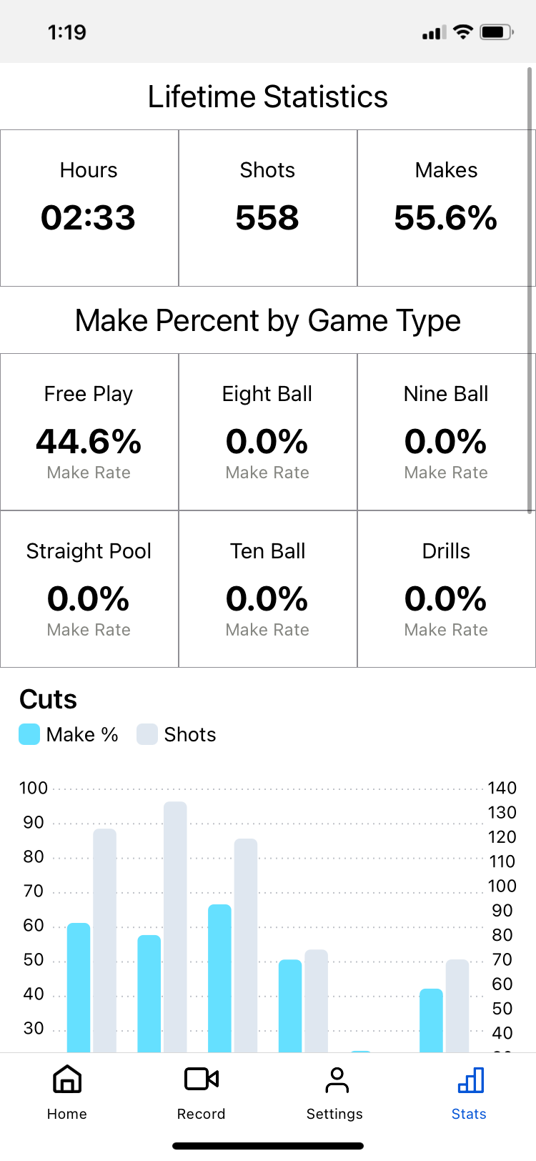


I was brought onto the team to shape the app into one that is well-loved and intuitive to use for the average pool player. My focus was on making the app accessible to players of differing abilities, some of whom are of an older generation.
Here are some things I did to achieve this goal:
Identify the needs of pool players by interviewing potential users.
Find the best way to help pool players consistently practice.
Present data in an easily understandable manner.
Design a video player (the main selling point of Railbird!) that is easy to navigate at first glance.
Simplify complex filtering system into one that is easily navigatable by users.
Discover methods to make the app “sticky.”
Create appealing visuals and UI that follow industry standards.
An overview of the Railbird.ai app upon alpha launch
Main challenges I faced while designing Railbird
As an early-stage startup, Railbird’s main priority is to secure funding by quickly getting users who are willing to pay for the service. As a designer, I have to set a balance between what users need and what the business requires. This often leads to addition of features that users do not feel strongly about, but adds to the stickiness of the app. It also means constantly stashing ideas to the backlog that meet user needs but require a significant amount of time and engineering work to implement that would not fit into the strict timeline to launch.
With limited resources, the Railbird team needs to push to get a feature out in the fastest way possible, often resulting in deviation from a reviewed design. Being the only designer in a full team of engineers, I’ve learned to adapt and work around situations such as this, but still push for my designs when it is absolutely necessary. Pushing for my designs becomes especially important when the deviation impairs an accessible user experience.
Design Challenge #1: What information are users looking for when using the video player?
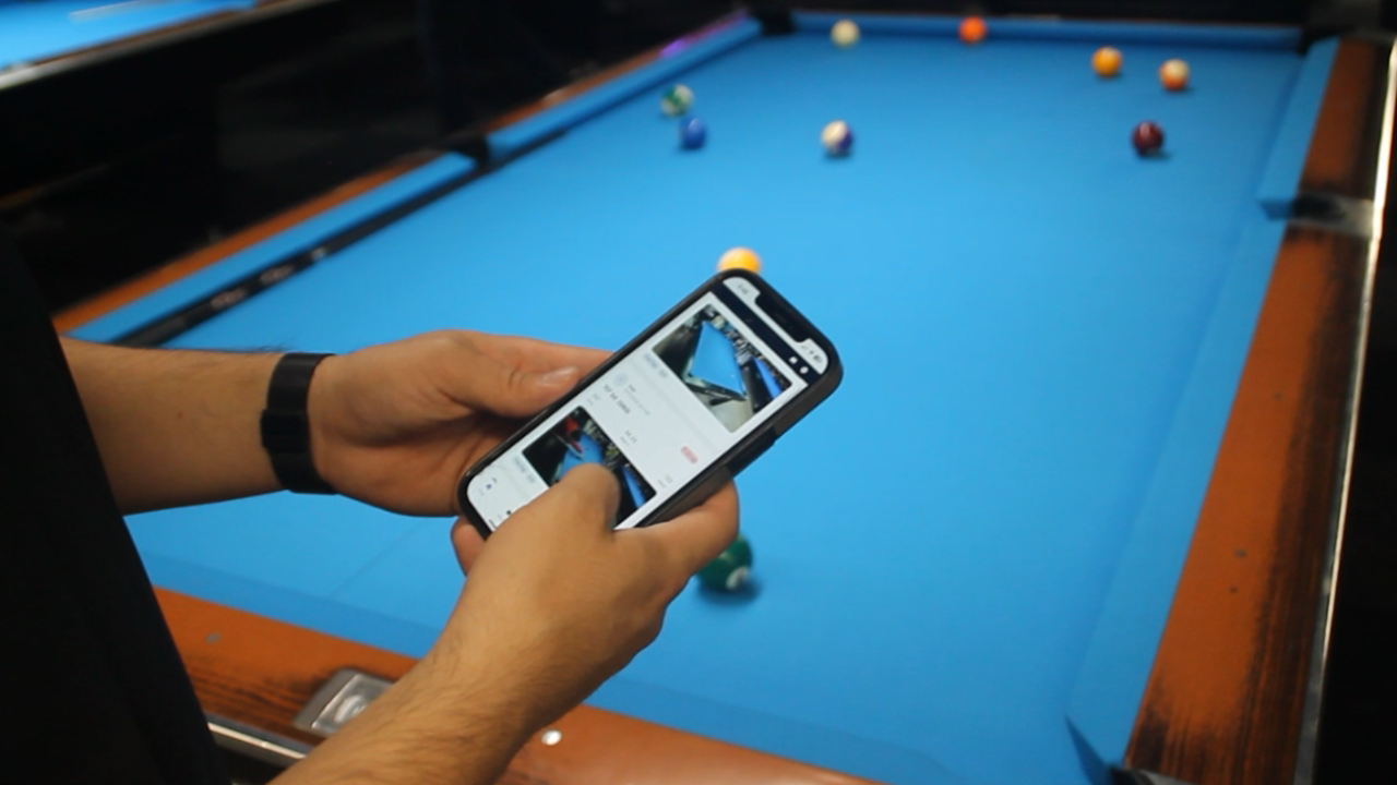
One of the selling points of Railbird is its video function. Using AI technology, Railbird cuts the in-between time between shots and shows users only the important stuff.
However, early versions of Railbird make using this feature frustrating. Therefore, I needed to find out why users would use the video player, what are they looking for?
!
Discussion with pool players shows that players like to rewind and play specific shots to check posture and learn from mistakes.
?
Through speaking with pool players about their practice routines, I learned that players only record their playing and watch these videos for these specific reasons:
Check if they have the right posture
See what mistakes they made and what they can do better next time
Find out what aspect needs practice
Show off amazing shots to friends
How might we make a video player that satisfies all the needs of pool players?
In more detail:

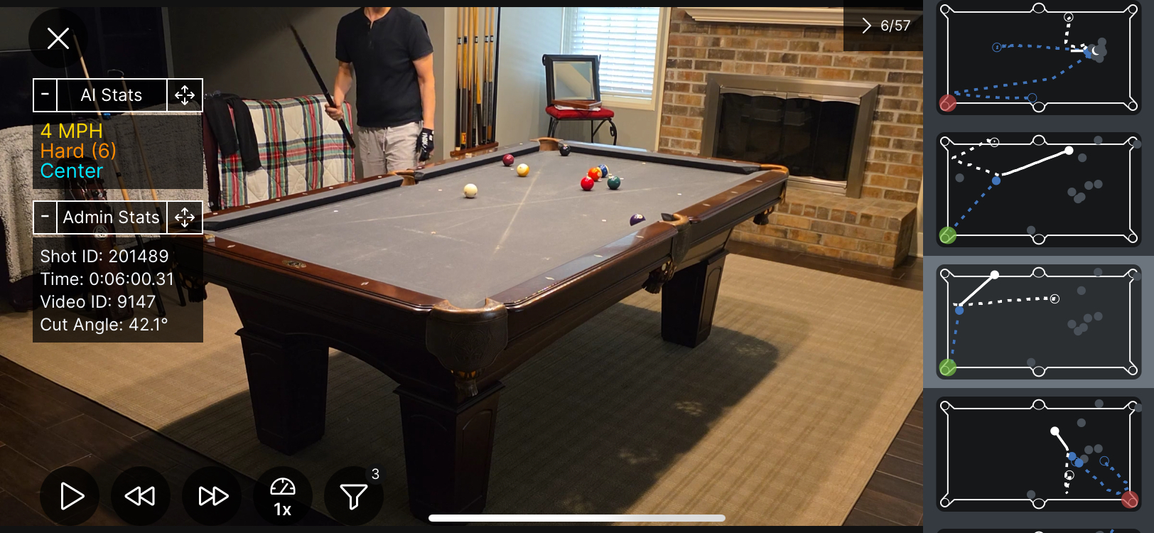
Here is a design created after the alpha launch, after multiple iterations.
To fit the needs of the users, I designed:
A “slide-open” playlist system for easily navigating between shots
Diagrams were created to provide an easy visualization of the shot
“AI Stats” shows information that users mentioned that they would like to see at a glance
A large area outside of the UI for watching the video so players can check their posture.
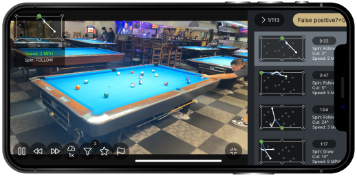
Below are the iterations the design went through. Changes were made to reduce clutter and provide more valuable information to the user.
Initial design before any engineering implementation.
Used screenshots of the video instead of minimalist diagrams, which proved to be inefficient in assisting users in identifying shots.
Although the UI visual is modern and professional, it became difficult to implement and does not scale well to devices with lower resolutions
The playlist was designed to stop the video once opened, instead of allowing users to navigate through the shots while watching the video at the same time.
Iteration before final design
Screenshots replaced by diagrams allowed a clearer identification of shots while also showing off the AI’s functions
As the app’s visual language matured, the playlist’s UI was modified to match the rest of the app
In this stage, a lot of UI information is redundant and repetitive, causing clutter. Examples include the repeat of the diagram on the top left while also showing the diagram in the playlist.
Playlist still takes up a lot of space; a better viewing experience is needed
Here, at the top of the playlist, filters are included. This was taken out in later iterations since the control buttons allow a module with filters to be pulled up.
Users stated that there is too much information on the playlist, and they almost never use them.
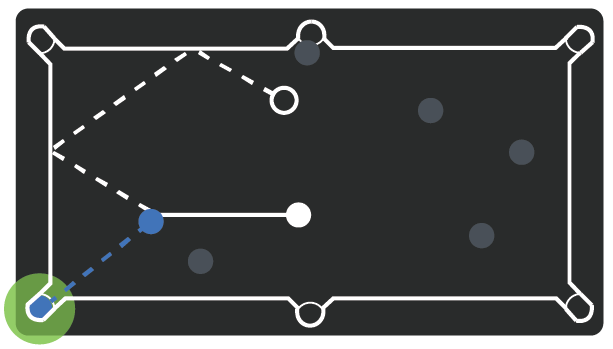
Diagram design process:
I designed the diagram in close collaboration with the team’s backend engineers. After learning how the AI visualizes shots, I used the pool diagrams used in tutorial videos as an inspiration for depicting a shot in a way that can be easily understood by most pool players.
A challenge I faced here is creating an accurate yet minimalistic depiction of the pool table. The AI uses exact dimensions, and a misplaced pocket may cause a strange visual disparity.
Impact: Selling point of Railbird.ai
Making the video player intuitive to use and easy on the eye allowed Railbird to sell its main feature.
Because of this design, users are more likely to download and use Railbird, and stick with it.
Design Challenge #2: Users have a hard time understanding Railbird’s data.
Presenting users with their performance data that they may use to improve their gameplay is one of the core functions of Railbird. However…
!
?
Early user research shows that users think the graphs in Railbird are difficult to engage with and overwhelming.
Graphs show important data, but it doesn’t mean anything to the user

>> Although bar graphs are easy to understand, users stated that the cut angle degrees do not mean anything to them. Pool players judge the angle of their shots visually while playing; the numbers here do not let them know which shot it is indicating.
>> The data is presented clearly and simply, but users stated that this graph can be intimidating due to its “math-ness” and an overwhelming amount in the types of data. This causes them to ignore the data section of the app completely.
>> Users wish that the data can be synthesized for them to apply in their practice sessions; they suggest adding an AI coaching function that the Railbird team does not have the resources or time to implement.
How might we present Railbird’s data in an interesting, intuitive, and useful way?
Solution: Graph design unique to Railbird that caters to pool player’s visual perception of shots and condenses the necessary information.
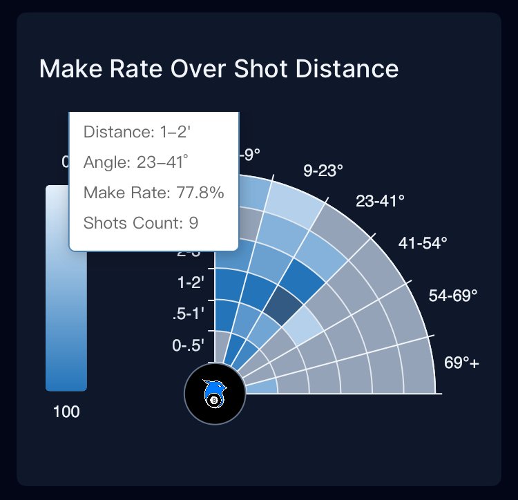
To make performance data more easily accessible and engaging, I decided that the best solution is to break out of conventional graphs to create one for the specific needs of pool players. Through active discussion with a pool player on the Railbird team, I designed a graph that presents data intuitive to pool players.
>> Taking inspiration from diagrams in pool tutorial websites and videos, I designed the graph to be more in tune with pool players’ visual perception of shots, thus solving the issue of having numbers that mean little to users.
>> A large amount of data is extremely overwhelming. I condensed the data in this design (such as showing both distance and angle, along with color-coded make rate) to reduce the number of graphs needed in the app.
>> A unique graph makes the app appear more engaging and reduces the perceived connectedness to math. This makes the app appear less intimidating.
Impact: Decreased User Churn
Creating a unique graph from scratch presents a heavy workload for the engineers and creates a learning curve. However, user needs make this design an improvement in user experience from the simple bar graphs, with the pros outweighing the cons. Inventing a new graph in this case is a necessary investment in time and resources.
The implementation of this design resulted in a 62% reduction in user churn as users can now engage more easily with a main feature of the app.
Possible Improvements:
Although this form of visualization proved to be an improvement for the app, some users state that the data still feels overwhelming to look at, and precise measurement of each shot is often not needed.
Therefore, I suggest that a future iteration of the design could group neighboring ranges of angles to reduce the amount of text needed, association with “math,” and the crowded feeling of the graph.
Design Challenge #3: Railbirds seeks to gamify!
To introduce another element of stickiness to the app, Railbird’s founders took inspirations from fitness apps such as Strata to influence users to stay on the app long-term.
Designs I created for gamification:
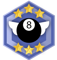
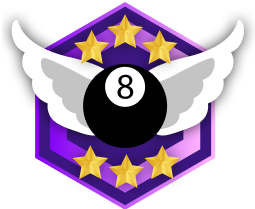
Badges:
Created using Adobe Illustrator. These badges are displayed in each session and in the user’s profile, rewarding them for using the app and accomplishing difficult shots. To not overwhelm the page with a dozen badges, I selected a few crucial ones to highlight here.


Impact: setting achievable goals for users, increased motivation which leads to more app usage
Getting one of these badges at the end of a fulfilling practice session gives the user a hit of dopamine that helps them feel accomplished. Not to mention, these badges helps summarize the session in a visually interesting way.
Design Challenge #4: Railbird has an extremely complex filter system…
Railbird seeks to help users find and analyze shots. A way to do this is to apply filters. However, one might say the Railbird’s filters are too powerful!
!
Railbird’s filter system is confusing and unintuitive
?
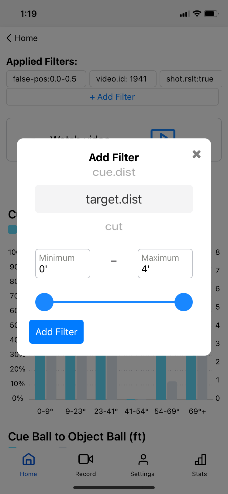

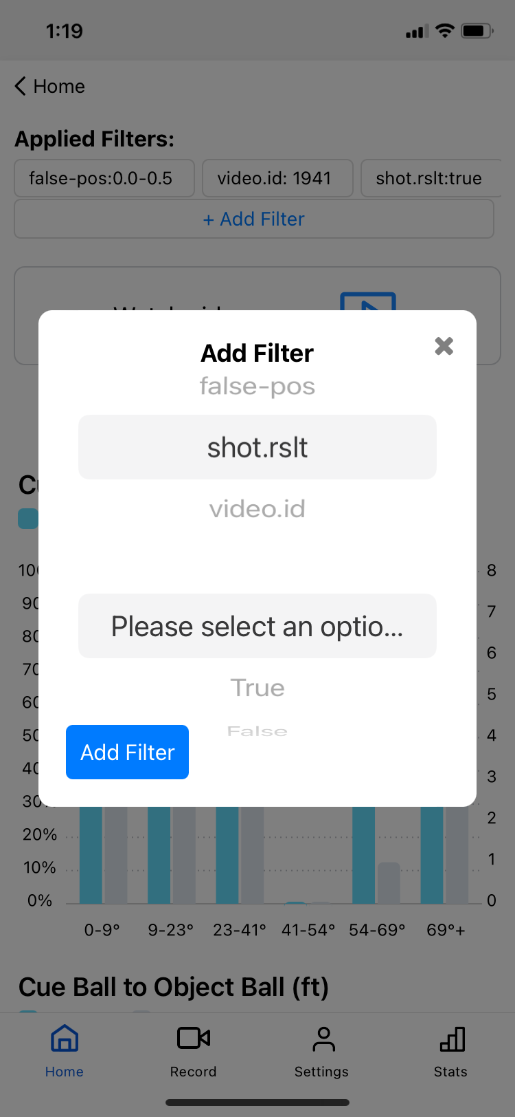
Initially, Railbird’s filters are structured as shown in the images.
The main problem lies in:
Railbird’s filters have 26 different parameters!
With 26 different parameters, the module shown in the images does not allow users to browse many options at once, which could lead to some filters not being used as intended — Railbird’s functions are not being applied to its full potential
Many of the filter options have cryptic names (i.e. “shot.rslt”)
It takes users a long time to find the filters they need, and they also don’t know all the filters available
Users stated that they almost never use filters, yet it feels intrusive in the UI, as if they have to use it
How might we create a filter system that feels intuitive and easy to understand, while presenting it as an “option” for the users instead of a necessity
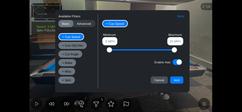
Landscape Mode
A point of contact of filters for the user is in the video player. It was placed here to prevent having to switch back and forth between the video and the session page just to adjust filters.
Filters were separated into “basic” for the most commonly used options, and “advanced” for options that are not strictly related to the pool shots
More options are displayed at once, allowing users to know all the options available and to quickly find what they need.

Portrait Mode

This filter structure also needs to be present in the portrait mode when viewed in the sessions page. This proved to be a great challenge that resulted in many discussions with the engineers.
The main problem is that the landscape filter module cannot be reused in exactly the same way for the portrait version. Otherwise, the available filters section will be squeezed to the side, making it hard to see and tap. This means new code and more work for the engineers.
It is also disorienting to have a slide-up module pop up in the middle of a video player. The consensus of the team is that having the video player filter module provide context in terms of allowing parts of the video player to show provides the best user experience
We eventually came to a compromise, resulting in a design that tries to reuse as much code from the landscape design as possible while providing a user experience that is easy to navigate and accessible
In addition:
The filters in the session page can be accessed by tapping the top-right filter icon
Toggle open and close, unintrusive, and introduces filters as an option, not a necessity
Something I had to watch out for when it comes to the filter buttons is color blindness accessibility
I had to make sure that the text is visible on the background color of the buttons
Even for someone with color blindness, the colors of the buttons should be significantly different from each other to prevent confusion
Luckily, our CTO is color blind, and became my point of contact when it comes to testing this issue
Impact: much friendlier filters means less users scared off
Through this design, the filters feature feels much more friendly. It does not take up so much space that users feel like it must be used in order to experience the app fully. It made an intimidating feature that turns users off into one that feels interesting to the nerds and easy to navigate, while not being forcibly pushed onto users who do not use this feature.
Possible Improvements:
Designing filters is always a challenging problem. Sometimes, there is no perfect answer. Although this design is a step up from the original filter system, I believe that through more user testing, more optimization may be made to improve user experience. For instance, some questions I would like to be answered through more research are whether users can find the filters they need, and whether they understand what the tabs mean by “basic” and “advanced.” Observing more user behavior can help me understand the next step in improving the filter system.
My user research created major impacts for Railbird.ai
To help influence my design decisions, I conducted multiple lightweight qualitative user research studies where I interviewed pool players about their practice habits.
These results ended up shaping future feature implementations and directions that Railbird.ai’s team chose to take, even after I have moved on from the project. These include:
Ability to “tag” certain shots
Drills and practice tools
Plans to allow users to find players of the same ability in their area (requires more users)
SYNTHESIS OF USER RESEARCH PRESENTED IN TEAM MEETING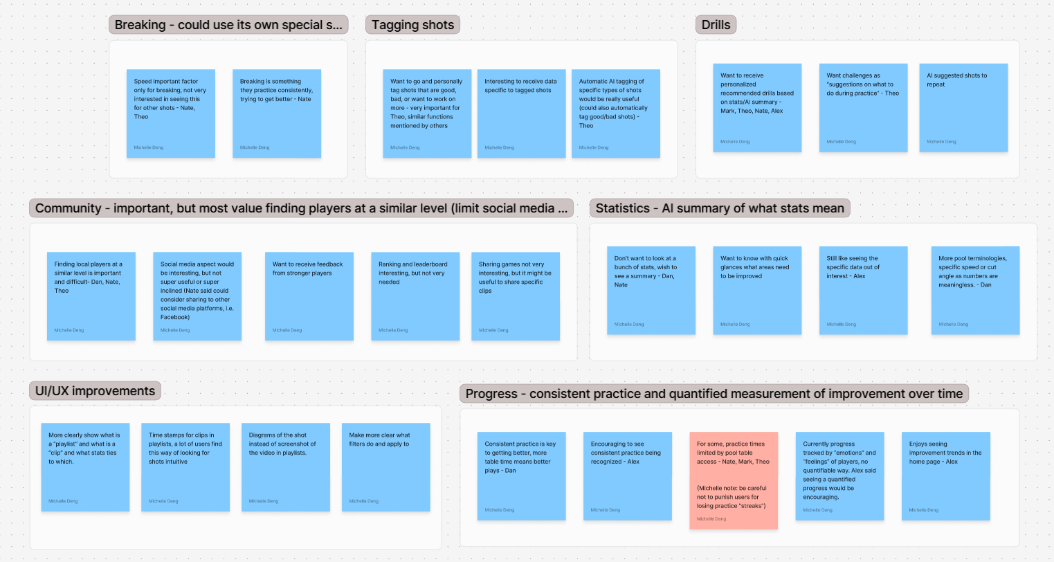
Closing thoughts
I joined Railbird in its infancy, and it has been an honor to shape the company and the app as the first designer on the team. This has been an extremely fulfilling project, especially when it comes to seeing my designs being brought to life and put into the wringers by the users. Although we part ways for now, I am excited to see what Railbird can grow into in the future.
I shaped the Railbird.ai app from one that seemed niche and intimidating to use, to one that hobby and professional pool players alike use on a daily basis. In the early stages, our alpha testers were doubtful about the future of the app. Some stated that this might not be a good idea to pursue. However, through our team’s collaborative efforts and constant communication with the pool community, we created an app that puts the user’s needs first and solves many of the issues that pool players face when it comes to practicing and improving.
Design Notes
What you see in this portfolio is a summary of the most impactful designs I created for Railbird. I was also responsible for Railbird’s design system, how its visual language matured, marketing/graphic design, and optimization of user flows (such as recording and uploading). To learn more about these topics, please contact me through my email at michelledeng3@gmail.com.