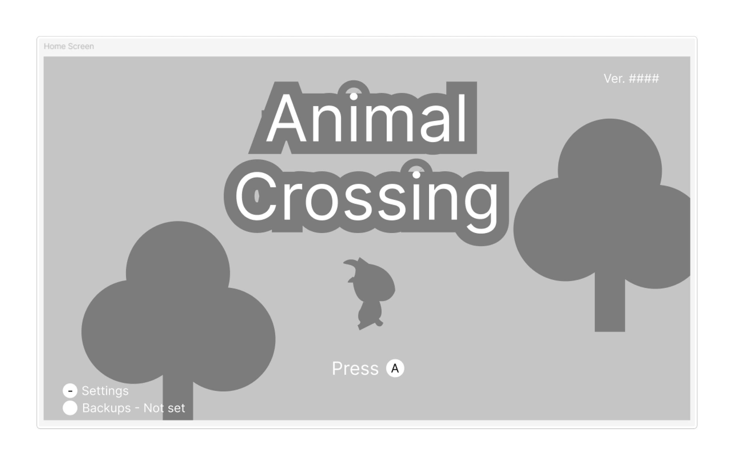
Animal Crossing New Horizons Case Study
ELVTR UX/UI in Gaming Coursework
About:
A study of Animal Crossing New Horizons as part of the ELVTR UX/UI in Gaming certificate course. This project is created to establish an understanding of UX/UI in a gaming context.
Responsibilities:
Understanding player needs
UX/UI Design
User Testing
Project Length:
7 weeks
Aug 2024 - Oct 2024
Challenges
Short time span
Limited access to art resources
Limited knowledge of established game design
Design Process
Research: Understanding players
Paper Prototype and User Flow
Wireframes
Usability Testing
UI Mockup
Accessibility Testing: Color Blindness
Research: Understanding Players
I watched a gameplay to understand Animal Crossing’s game design, UI elements, and player experiences. Here’s what I learned:
As an introduction to the game, players learn how to control their character through game dialogue. Although this is great for immersion, players can easily forget the controls.
My suggestion: show tooltips when players need to apply a button
It is difficult to switch tools using direction buttons. Players often need to take additional steps to open a radial tool bar or the inventory.
My suggestion: Allow preview of tools to switch to when pressing directional buttons
Player Journey
Paper Prototype and User Flow
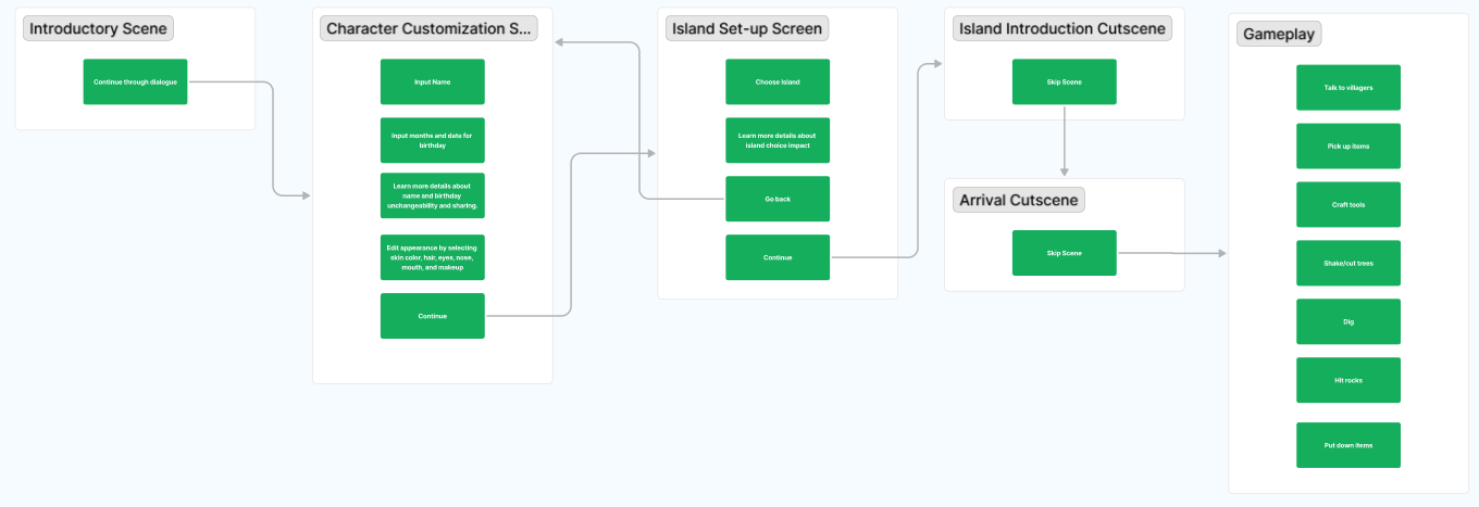
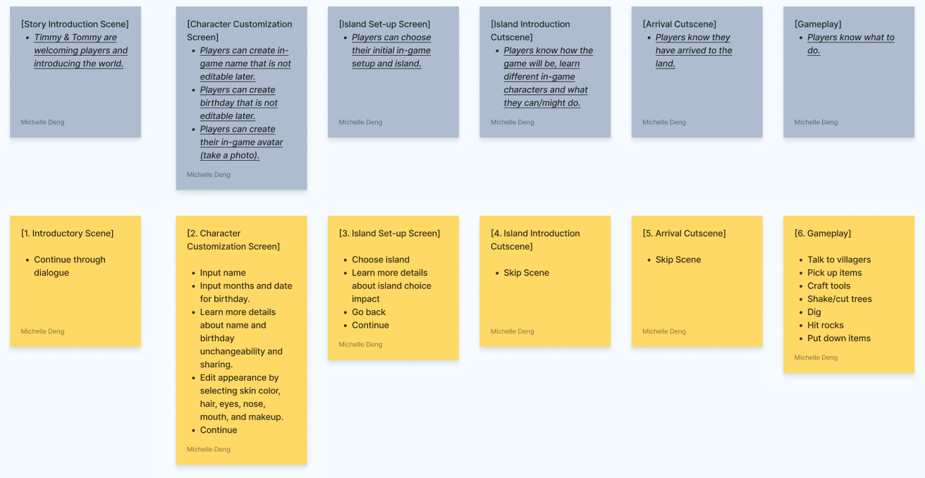
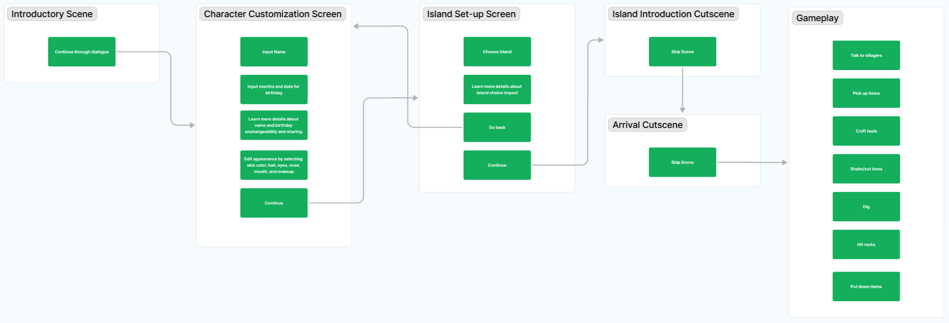
To understand players’ process of playing the game and fine tune their interactions with UI elements, I created user flows of the experiences of new players
Wireframes
Incorporating my suggested changes to the UI from what I learned from understanding player needs and emotions, I created wireframes of the home page, gameplay, and inventory. I later put them through user testing to learn about their intuitiveness.
Usability Test
Objective: Understand whether players know how to navigate from one screen to another, know what each UI element means, and find the UI layout visually appealing
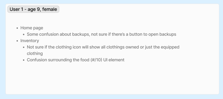
Recruitment: 3 testers.
Target audiences: 9-55 years old, male and female, play cozy games.
Notes / Results:
Confusion about whether the clothing icon will show all clothing owned or just the equipped clothing
Players are not sure how to save and exit the game
Older players think that the money displayed in the inventory means how much a selected item costs.
Confusion about what tools are equipped that needs to be put away
Wireframe changes
Added “Wrap it up” to the top right of the screen, above auto-save notifications, to show players how to save and exit the game.
More clearly showed what tools are equipped, and incorporated my previous suggestion to allow tool switch previews
Changed the inventory to show more clearly that clothes found by selecting the clothing icon are equipped.
Added price tags to selected item to avoid confusion that the money icon shows the price of items
UI Moodboard
Moodboard: references sourced from gameuidatabase.com
UI Style Guide
I closely observed Animal Crossing’s UI elements to achieve an understanding of their use of colors, typography, and shapes. I tried to imitate the existing design language as much as possible while incorporating new UI elements.
Initial Iteration
Accessibility Testing: Color Blindness
I used a color blindness simulation (https://www.color-blindness.com/coblis-color-blindness-simulator/) to test whether all elements in my mock up are visible
Resulting Change:
Button UI for accessing the inventory and putting away tools are difficult to see in the color-blindness simulator. Therefore, I changed the layout, sizing, and stroke of these buttons to make it more clear
Before
After
Final Mockup
Outcomes
Gained a deeper understanding of how UI/UX is applied in a gaming context.
Learned how to create user interfaces and user experiences that do not interfere with the intentions of game designers.
Gained crucial skills to carefully observe user interface in pre-existing games and imitate to stay on visual target.
Post-Mortem
This project was an amazing exercise to get my foot in the door for UI/UX in gaming. In the future, I hope to do more user testing on my mockups and create quality-of-life changes for player set-up screens.


